Atmosphere from the first frame
Visual direction leads the experience: an expressive hero, carefully selected imagery and a confident style create a distinctive opening without making visitors work to understand the page.
 PLACEHOLDER
A published web showcase built around atmospheric imagery, bold art direction and a polished, responsive interface. VELES combines a memorable first impression with a clear browsing experience and deployment on Vercel.
Explore the project onlineVisit the websiteOpens in a new tab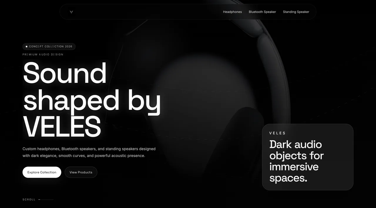
Explore the original website inside this case study. The live website stays on its own domain.
The case study and project imagery remain available below.
VELES began with a simple creative ambition: make the website itself feel like an expression of identity. Rather than leading with long explanations, the experience would communicate through atmosphere, carefully chosen imagery, strong typography and a confident visual rhythm. The goal was a premium presentation that attracts attention immediately while giving visitors a straightforward way to continue exploring the work.
A visually ambitious website can quickly become difficult to navigate if every section competes for attention. For VELES, the central challenge was to balance an expressive first impression with legibility, clear hierarchy and practical usability. The visual system also had to adapt to smaller screens without losing its character, while remaining manageable to deploy and update.
We organized the presentation around an impactful opening, selected showcase imagery and a clean gallery flow. Deliberate spacing and typographic contrast give each element room to breathe, while consistent layout rules carry the same visual language through the page. Responsive design and transitions that support rather than interrupt browsing keep the experience coherent from desktop to mobile.
The original portfolio documents VELES as a published website showcase deployed through Vercel. Its delivered scope includes a visual landing experience, showcase and gallery presentation, custom responsive UI and a live deployment workflow. The case study illustrates our approach to atmospheric digital presentation and considered interaction design; it does not claim independently measured loading times, conversion improvements or client results.
Visual direction leads the experience: an expressive hero, carefully selected imagery and a confident style create a distinctive opening without making visitors work to understand the page.
Typography, spacing and a restrained content hierarchy establish a premium feel. Each section has a clear role, allowing showcase images and the gallery to remain the focus rather than compete with decorative interface elements.
Flexible layouts and responsive presentation preserve the hierarchy on desktop, tablet and mobile. The original showcase also documents deployment on Vercel, making the work accessible as a published web experience.
Tell us what you are imagining. We’ll work out the next step together.
Pricing & packages