A premium first impression
A confident hero and carefully composed watch imagery introduce the brand through atmosphere rather than excessive copy. Elegant type and breathing room give the opening a distinctly premium character.
 PLACEHOLDER
A luxury-watch website showcase published on Vercel. An image-led landing experience, considered typography and a refined collection layout give the watches a confident presence on desktop and mobile.
Explore the project onlineVisit the websiteOpens in a new tab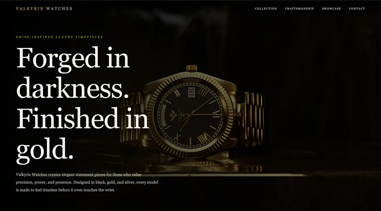
Explore the original website inside this case study. The live website stays on its own domain.
The case study and project imagery remain available below.
A watch is often judged through its smallest details: the case, dial, finish and sense of craft. For Valkyrie Watches, the idea was to translate that close attention into a digital brand experience. Instead of building a busy storefront, we wanted a composed presentation where striking product imagery, deliberate spacing and a refined visual identity help the collection speak for itself. Each section should add to the feeling of a premium watch brand.
Luxury design depends on restraint, but product discovery still needs structure. The central challenge was to preserve a strong, atmospheric first impression while making the collection inviting and easy to explore. Large visuals had to coexist with readable text, clear navigation and useful product storytelling. The same sense of quality also needed to carry across tablet and phone screens rather than exist only in a desktop mockup.
We organized the showcase as a product-led journey: an expressive landing section establishes the brand's tone, followed by a collection presentation and gallery that give the watches room to be examined. Controlled typography, generous negative space and consistent image framing create an editorial rhythm. Responsive compositions maintain the hierarchy across screen sizes, with interface elements kept secondary to the products.
The original portfolio documents a luxury-watch website concept published through Vercel. The showcase brings together a branded landing experience, watch-collection presentation, gallery-oriented product storytelling and a custom responsive interface. Its purpose is to demonstrate a sophisticated direction for presenting high-end products online. It is not presented as a verified commercial store, and no checkout functionality, sales results or conversion improvements are claimed.
A confident hero and carefully composed watch imagery introduce the brand through atmosphere rather than excessive copy. Elegant type and breathing room give the opening a distinctly premium character.
A product-oriented layout and gallery create room for watch details, finishes and the larger visual story. The hierarchy guides visitors through the collection while keeping the product itself as the focal point.
The responsive structure keeps images prominent, text readable and navigation clear across desktop, tablet and phone. Consistent spacing and visual emphasis help the design retain its refined character on smaller screens.
Tell us what you are imagining. We’ll work out the next step together.
Pricing & packages