A clear first impression
The landing section uses a considered visual hierarchy, readable typography and direct navigation to introduce the experience. It makes room for the message without adding unnecessary interface clutter.
 PLACEHOLDER
A modern responsive website published on Vercel, bringing a clean visual identity, structured landing experience and showcase gallery together in an intuitive interface across screen sizes.
Explore the project onlineVisit the websiteOpens in a new tab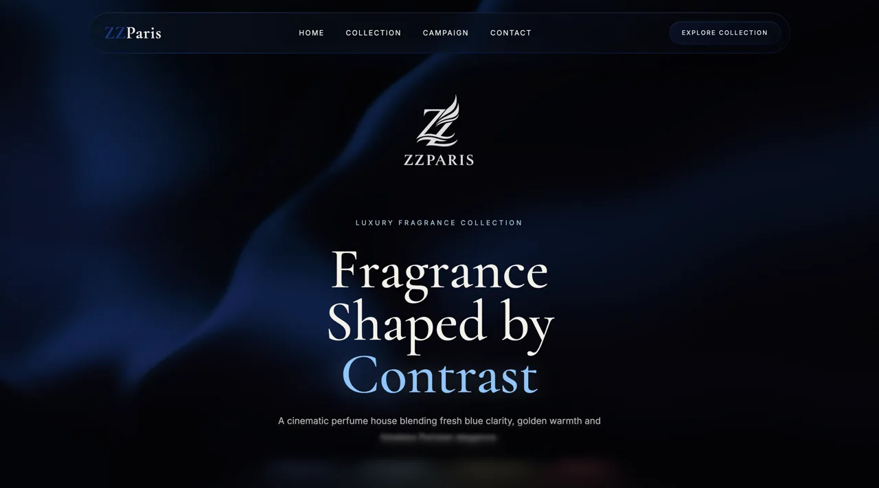
Explore the original website inside this case study. The live website stays on its own domain.
The case study and project imagery remain available below.
We approached ZZParis as an exercise in making a digital presentation feel effortless. A well-designed website should explain itself through layout before a visitor reads every line of copy. The idea was to create a clear, contemporary experience with an immediate opening statement, room for showcased content and a gallery that visitors could explore at their own pace. Visual polish would support the message instead of overwhelming it.
A minimal interface can appear simple, but maintaining clarity requires careful decisions about hierarchy, content order and spacing. For ZZParis, the challenge was to make the landing page feel distinctive while keeping navigation straightforward and the showcased work easy to scan. The composition also had to adapt gracefully to smaller screens, without losing the structure and visual consistency established on desktop.
We organized the page around three complementary moments: a focused landing section for the first impression, a showcase for selected content and a gallery for deeper visual exploration. Restrained typography, deliberate spacing and consistent image presentation create a coherent rhythm between them. The custom responsive layout keeps the hierarchy readable on desktop, tablet and mobile, with transitions that support rather than distract from browsing.
The original portfolio documents ZZParis as a finished website published through Vercel. Its presented scope includes a polished landing page, showcase and gallery sections, custom responsive UI and a production deployment. The design prioritizes clear communication and a smooth experience across devices, with fast loading treated as a design objective rather than an independently verified benchmark. No unsupported visitor, conversion or business results are claimed.
The landing section uses a considered visual hierarchy, readable typography and direct navigation to introduce the experience. It makes room for the message without adding unnecessary interface clutter.
A distinct showcase section introduces selected content before the gallery invites closer exploration. Consistent framing and measured spacing make the transition between overview and detail feel natural.
The interface retains its visual rhythm when moving from wide screens to tablets and phones. Flexible content blocks and straightforward navigation keep the browsing experience coherent, with deployment handled through Vercel.
Tell us what you are imagining. We’ll work out the next step together.
Pricing & packages