A confident first impression
An image-led hero, decisive typography and a clear opening message make the company’s purpose immediately understandable. The design aims to establish a professional tone before asking visitors to explore further.
 PLACEHOLDER
A responsive website concept for a construction company, bringing together a confident first impression, clearly presented services and a project showcase that helps prospective clients understand the business.
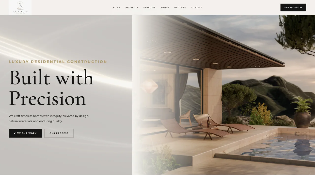
In construction, a website often makes the introduction before a conversation ever begins. We approached AURALIS as a concept for a building company that needs to communicate reliability without relying on complicated language or visual noise. The idea was to give the business a confident digital presence: a strong opening statement, an understandable service offer, space for completed-project examples and a direct route to contact.
A construction company may work across very different services and project scales, yet a first-time visitor needs answers quickly. What does the company do? What kinds of projects does it take on? Why should someone trust it with a serious investment? Our design challenge was to balance a strong, professional visual identity with practical information, keeping the message convincing on large screens without losing clarity on a phone.
We shaped the concept around a focused business landing page: an image-led opening, a service overview, a dedicated area for project references and clear prompts to start a conversation. A considered typographic hierarchy and generous spacing keep each part easy to scan. Rather than competing with the construction work itself, the visual design gives that work room to become the evidence of experience and capability when real project material is available.
The result is a responsive construction-company website concept with a business-oriented hero, clear service presentation, dedicated space for project imagery and references, and visible contact calls to action. As a portfolio design study, AURALIS demonstrates how a construction brand could communicate professionalism and lead visitors naturally toward an enquiry. It is not presented as a deployed client website, and no unverified business results are attached to it.
An image-led hero, decisive typography and a clear opening message make the company’s purpose immediately understandable. The design aims to establish a professional tone before asking visitors to explore further.
Instead of presenting construction services as a dense catalogue, the concept separates the offer into legible sections that explain capabilities and leave room for relevant project examples.
A responsive structure keeps service information, portfolio space and contact actions easy to follow on desktops, tablets and phones. The goal is a consistently trustworthy presentation, not animation for its own sake.
Tell us what you are imagining. We’ll work out the next step together.
Pricing & packages