01The idea
A research initiative needs more than an attractive homepage. Its website must introduce the project to people who may be encountering the subject for the first time, while giving academic and institutional audiences a reliable place to follow the work. For SATECON, the idea was to translate an interdisciplinary smart-agriculture initiative into a coherent public-facing story: explain the purpose, introduce the partners and make room for activities and updates as the project develops.
02The challenge
Academic projects bring together objectives, institutions, research topics and ongoing communication. Presenting everything at once can leave visitors unsure where to begin, especially if they are unfamiliar with smart agriculture. We needed a structure that distinguishes the project's mission from the organizations behind it and from its news, without sacrificing credibility or clarity. The same information also had to remain easy to browse on phones as well as desktop screens.
03Our approach
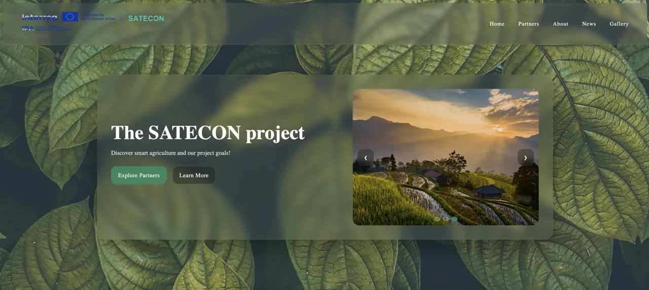
We organized the experience into purposeful content areas: a welcoming landing page explaining SATECON and its goals, a dedicated overview of academic and institutional partners, and clear spaces for news, project activities and supporting visuals. Readable typography, straightforward navigation and a restrained visual hierarchy help visitors move between those subjects. Responsive layouts keep the academic presentation usable across devices without distracting from the information.
04The delivery
The SATECON website presents the project's smart-agriculture focus, its goals and collaborating institutions, alongside sections for news, updates and visual material. The original portfolio documents a responsive frontend built with HTML, CSS and JavaScript, with emphasis on accessible structure and clear academic communication. The result is a project presentation designed to support public understanding and ongoing updates; it does not imply independently measured research impact or engagement growth.